Par mail
Solene.lepretre.petitjean@gmail.com
+33 624131808

Bloomsquare – redesign

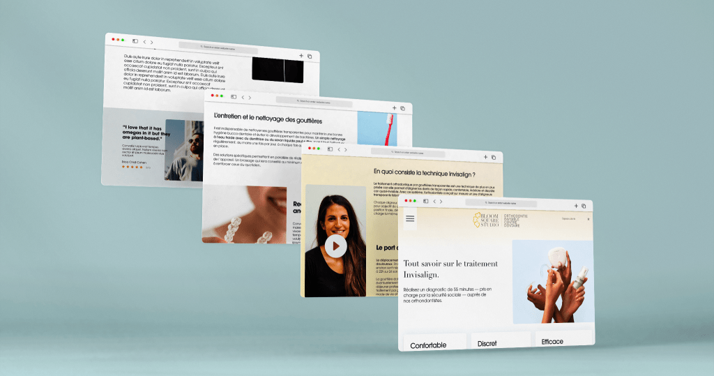
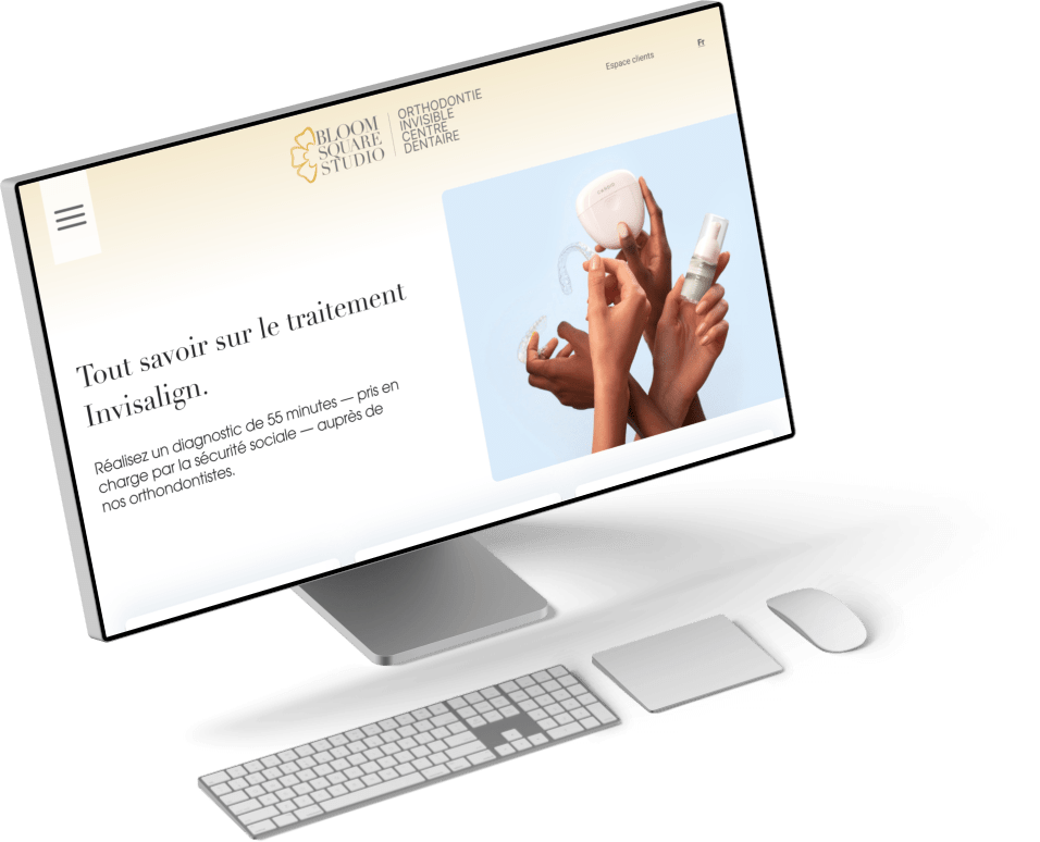
As part of the redesign of the Bloom Square Studio website, specializing in invisible dental treatments, I was tasked with rethinking the site’s UX and UI. The challenge was to transform dense, technical content into a fluid, clear, high-end experience while creating a coherent visual identity.

  • Client

    Bloomsquare

  • Rôle

    Product designer

  • Outil

    Figma

Boolmsquare

In search of his identity,
A little background

Bloom Square Studio is an orthodontic center specializing in invisible dental treatments, including the Invisalign method.

Unlike other players in the market, often positioned on low-cost “friendly” solutions, Bloom Square Studio has chosen a different approach: offering a high-end treatment experience, centred on luxury and personalized support for each patient.

Challenges of the old site

  • Dense, technical content: Too much text with exclusively orthodontic vocabulary, not easily accessible to users.
  • Lack of transparency: No clear presentation of the steps in the treatment process.
  • Lack of pricing information: No indication of treatment costs.
  • Lack of brand identity: The site did not reflect the differentiating, premium image sought.
My missions

I was commissioned to carry out a UX audit, followed by a complete UX and UI overhaul of Bloom Square Studio’s current website.

My first task was to map the site’s pathways, list page content and study navigation. I detected the major obstacles to a good user experience: complex navigation, redundant content and highly technical medical vocabulary.

Customized support

Naviguation & wireframes

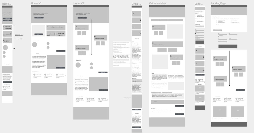
This project was the customer’s first website redesign. This represented a particular challenge, as he found it difficult to project himself and visualize the final rendering from simple wireframes.

To meet this need, I began by sorting and organizing the content with him and his teams directly on Figma, taking care to structure the information clearly and intuitively.

Then, to make the project more concrete, I presented all the pages and models via a detailed PowerPoint, making it easier to understand the design choices. The wireframes produced for this project were deliberately low-fidelity: they enabled us to concentrate on the structure and user path before moving on to a more accomplished design.

La création d'une identité

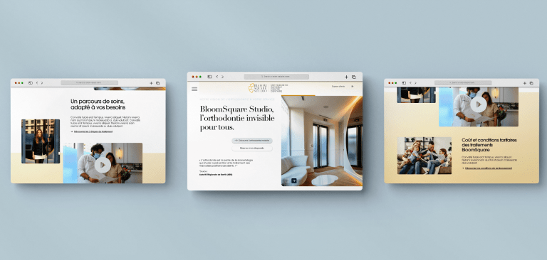
L'UI design

Home page 

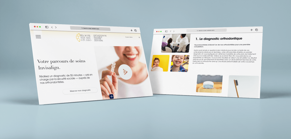
Treatment page

What I've learned

Page Invisalign 

This project enabled me to develop my ability to adapt to my client’s profile and knowledge, adjusting my working method to make him an active participant in the process.

I also learned how to create a coherent visual identity and how to apply it to a dozen or so pages, taking care to maintain graphic harmony while meeting the specific needs of each section of the site.

Back